My panic was brief but real. It may have been my fault for procrastinating or forgetting to ask my client for their logo file to complete the project. Either way, I found myself in a tight spot. The situation? I needed to finish a design project that required a company’s logo, but I didn’t have it.

When Logo Files Are Missing
A Guide to Re-Creating Artwork and Fonts
By Shon Roti
(Originally printed in the March/April 2025 issue of Insights.)
My panic was brief but real. It may have been my fault for procrastinating or forgetting to ask my client for their logo file to complete the project. Either way, I found myself in a tight spot. The situation? I needed to finish a design project that required a company’s logo, but I didn’t have it.
I had the option to either use artwork directly from their website—a 72 ppi, low-resolution image—or reach out to someone from the organization to request a higher-quality file. However, based on my past experience, neither of these options is good or timely. Often, when I request artwork, I receive an image that someone, with good intentions, has simply pulled from the website and emailed to me. Rarely do I get a high-resolution logo that works for what I need.
My panic was brief because I knew I could rely on the tools in CorelDRAW and the skills I’ve developed using this software for problem-solving. Necessity is the mother of invention, and I’ve been in this situation a time or two.
For the sake of this article, I’m going to say that the client was the Smithsonian Institution, which, if true, would have made this process much easier since most government agencies have vector art available for download online that comes in an SVG (Scalable Vector Graphics) file format. Note: Wikipedia and brandsoftheworld.com are good resources for vector files for government agencies. Additionally, right-clicking on the logo of many government websites will allow for the download of an SVG file. Figure A illustrates the difference between a raster image and vector artwork with a close-up of both examples.
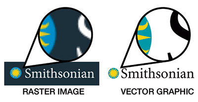
Figure A
The CorelDRAW version used for this article is 22.1.1.523 (2020). However, the Smooth tool and the Trace Bitmap tool, (both of which are highlighted in this tutorial) have been available since 2014 and 2006, respectively.
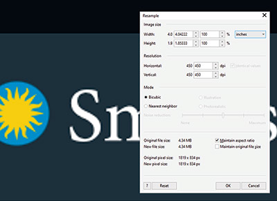
Figure B
In this article, I’m focusing on the text portion of the logo. According to the AI chatbot ChatGPT, the font used in the Smithsonian’s logo is called Adobe Garamond and is available only with an Adobe Creative Cloud subscription. Alternatives suggested by AI included open-source fonts EB Garamond and Cormorant Garamond, both available from Google Fonts as a free downloads. In my opinion, however, neither of these were an acceptable match. Second note: Other handy font identifiers are fontsquirrel.com and whatthefont.com. They offer decent results and are easy to use. You can upload a JPEG or PNG file containing an example of the font in question and the websites will help identify it.
So what should you do next? If neither of the two options sounds appealing—paying for a font or using an inadequate substitute—then the third option is to fix the problem using CorelDRAW and Corel PHOTO-PAINT.
Corel PHOTO-PAINT Steps
After downloading the low-resolution image, open it in Corel PHOTO-PAINT and upsample it by increasing the points/dots per square inch. I have found that upsampling the image first to a higher resolution accomplishes a couple of things. First, it adds more pixels/data for the software to work with, resulting in better rendering. Second, it helps reduce or soften jagged edges, ensuring a smoother transition when converting the image to a vector graphic (the next step in the process after upsampling).
Next, navigate to Image > Resample and set the dpi to 450 by 450 at the intended final size. I’ve chosen a one-by-four-inch size. More recent versions of Corel include options to render this using Illustration or Photograph mode. Choosing Illustration is the ideal option, though it may take additional time (a couple of minutes in my case). The time required for this process will depend on the computer’s processing power.
For a slightly faster yet likely acceptable result, leave the Illustration and/or Photograph option unchecked. Click OK (figure B).
If the graphic being rendered consists of only one color, I recommend saving the file as a black-and-white bitmap to simplify the next step in CorelDRAW. Navigate to Image > Convert to Black and White, choose Line Art as the conversion method (figure C), and click OK. When saving, select BMP as the file type. For a logo containing multiple colors, save the file as either a PNG or JPEG to preserve the color.
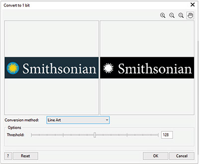
Figure C
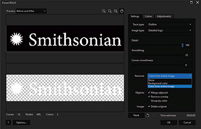
Figure D
CorelDRAW Steps
The next step is to transform this raster image (made of pixels) into a vector file. Import the newly created file into the workspace. With the image selected, go to Bitmaps > Outline Trace > Detailed Logo.
There will be a few slider options that need to be adjusted. As a good starting point, set the Detail Level to 100, Smoothing to 25, and Corner Smoothness to 25. To remove the background, use the selection tool in the same interface to select the black background. Then, open the Remove drop-down menu and choose Color from Entire Image (figure D). Click OK.
In the CorelDRAW workspace, both the raster image and the new vector graphic will appear. Delete the raster image. Then, select the remaining vector graphics and group (Ctrl+G) all the objects together. Change the object’s color to black for better visibility. Zooming in on the new graphic will reveal the results in detail (figure E). In this instance, a bit more smoothing is needed, and the Smooth tool is tailor-made for this process.
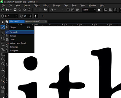
Figure E
With the graphic selected, go to the menu bar on the left, click on the Shape tool drop-down menu, and select the Smooth tool (figure F). Once selected, two settings can be modified: Nib (brush) Size and Rate (the speed at which the effect is applied). Since the text is about an inch tall, a 0.25-inch Nib Size and a Rate of 25 should work well. Some experimentation may be needed to determine the ideal speed for the desired effect.
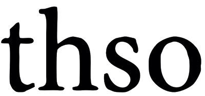
Figure F
Click and drag the Smooth tool in areas that need refinement. Be careful not to overdo it—this tool can easily get out of hand. Overusing this effect may distort the font so much that it becomes unrecognizable from its original design. Within a minute or two, the final result can be quite convincing. And to the untrained eye, it will be indistinguishable from the actual font.
Shon Roti is the owner of 9th Street Designs. He has more
than 25 years of experience as a production artist, graphic
designer, and instructor in the awards and promotional
products industry. In 2014, ARA named him Speaker of the
Year. You can contact him at info@9thsd.com.