In the world of personalization, visuals are often the first thing people notice. Whether it’s a striking poster or an eye-catching promotional product, the right image can make or break the message. As a designer, I’m often tasked with finding images or photos that complement a client’s logo.

Replacing Color in a Photo to Achieve Brand Harmony
How to Adjust Photo Hues for Cohesive Visuals
By Shon Roti
(Originally printed in the January/February 2025 issue of Insights.)
In the world of personalization, visuals are often the first thing people notice. Whether it’s a striking poster or an eye-catching promotional product, the right image can make or break the message. As a designer, I’m often tasked with finding images or photos that complement a client’s logo.
But the reality is, it’s rare to find a photo that seamlessly matches branded colors straight out of the box. This means I need to adjust the colors to match the logo. For instance, in figure A, the Jeep’s paint color perfectly matches the logo hues. This did not happen by accident—it was a deliberate process of adjusting the photo’s colors.
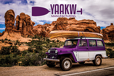
Figure A
Matching the colors of a design can be tricky, especially when working with photos. Unlike vector objects, photos may contain hundreds of thousands, even millions, of different-colored pixels that make up a composition. Manipulating these pixels to align with a design’s aesthetic requires precision and the right set of tools.
In this tutorial, I’ll be using Adobe Photoshop version 25.12.0 (2025) and Corel PHOTO-PAINT version 24.5.0.731 (2023). I will go over how to modify colored pixels while preserving the photo’s natural look.
The photo used in this tutorial is in the public domain, and a free download can be found by scanning the QR code on the right. The logo is a fictional creation I made for this tutorial.
Adobe Photoshop Steps
After opening the image in Photoshop, I copied and pasted (Ctrl+C, Ctrl+V) the logo into a new layer for a visual reference of the color. As a safety precaution, I duplicated the background layer (Ctrl+J) of the photo (figure B). I like to keep the original background layer to refer back to or copy from if needed at any point during the project.
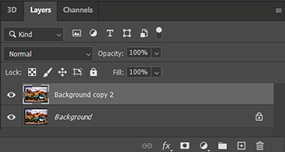
Figure B
To modify only the Jeep’s cyan paint color, I first needed to select this area and create a mask from the selection. Choosing the right selection tool can save time. Every photo is going to be different, but in this instance, I found that the Object Selection Tool (W) with the Lasso option (figure C) worked well because there was enough contrast between the pixels needing selection and the surrounding pixels for Photoshop AI to distinguish between the two. An exact selection is not required with this tool. Simply encircling the area with a fairly wide margin is sufficient. Photoshop’s AI will generally detect the edges of the desired selection.
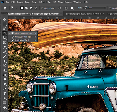
Figure C
If there are additional areas that need to be selected, hold the Shift key and encircle the areas that were not included. Other selection tools, such as the Lasso, Polygon, and Magic Wand tools, can also be used to add to the selection while holding down the Shift key. However, these tools require more precise control, as they do not have AI capabilities built into them.
Once all the pixels needing modification have been selected, create a new adjustment layer (figure D). Because this new layer is created with the selection active, a mask will be automatically applied to the layer. Only the areas that are white inside the masked selection will be affected.
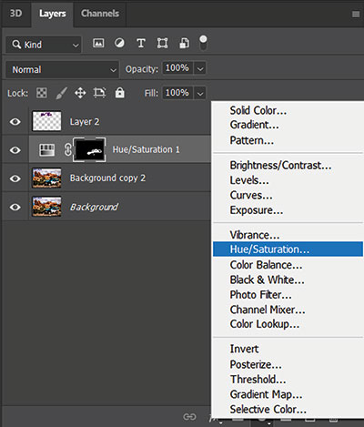
Figure D
To ensure the correct range of color is being modified, use the hand icon to click on the cyan color of the Jeep (figure E). To test the effectiveness of this range, drag the Saturation slider all the way to the left (-100) to desaturate. If any cyan pixels remain, adjust the sliders at the bottom to expand the range and include more colors.

Figure E
With the adjustment layer active, move the Hue slider to the left and right to explore the full range of colors and find a hue that best matches the logo.
When finished modifying, save the Photoshop file. Then right-click on any active layer, select Merge Visible (figure F), and go to File > Save As to create a new file with all the changes.
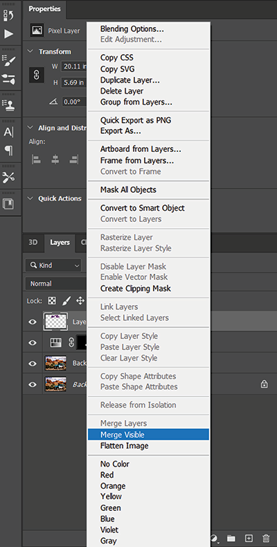
Figure F
Corel PHOTO-PAINT Steps
Colors on images can be modified similarly in Corel PHOTO-PAINT, although the selection tools in PHOTO-PAINT are not as intuitive as Photoshop’s.
To modify the colors on an image in PHOTO-PAINT, select the cyan areas of the Jeep with a combination of the Freehand Mask and Magic Wand Mask tools.
With the same photo open and with the cyan area selected, copy and paste it. This will place the selection into a new layer. Go to Adjust > Hue/Saturation/Lightness (figure G). Use the Hue slider to adjust the colors as needed, similarly to the Photoshop slider.
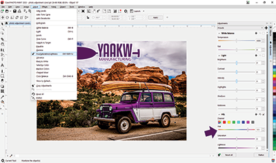
Figure G
This basic hue adjustment does not involve a range of color as in Photoshop. Therefore, areas that do not need adjustments, such as the windows of the Jeep, should not be included in the selection.
Note: A more precise selection of color is available in Corel PHOTO-PAINT if you use the Replace Colors option under the Adjust menu tab. This interface has a steeper learning curve and is much different than the steps mentioned in Photoshop. We will cover it in a future guide.
In both Photoshop and PHOTO-PAINT, hue adjustments will not affect any white areas of the selection—only those pixels that already have color.
Shon Roti is the owner of 9th Street Designs, a sublimation and graphic-design-consulting and promotional-products business. A graphic designer, Roti has spent more than two decades working as a production artist and instructor in the awards and promotional products industry. In 2014, ARA named him Speaker of the Year. You can find him at www.9thsd.com or contact him at shon@sublimationconsultant.com.