I’ve often said I use about 10% of the CorelDRAW Suite tools 90% of the time. I’m sure that is probably true for most designers. But every so often a new tool or technique becomes a bigger part of my design arsenal. And once those tools are ingrained into my workflow, they create new paths for my creativity and increase efficiency.
Vital CorelDRAW Tools for Tailored Designs
Unlock New Paths for Creativity and Efficiency with Vintage Design Techniques
By: Shon Roti, Graphic Designer
(Originally printed in the May/June 2024 issue of Insights.)
I’ve often said I use about 10% of the CorelDRAW Suite tools 90% of the time. I’m sure that is probably true for most designers. But every so often a new tool or technique becomes a bigger part of my design arsenal. And once those tools are ingrained into my workflow, they create new paths for my creativity and increase efficiency.
I was recently asked to produce an 11-inch by 17-inch poster for a summer company gathering. It needed to be done in their branded colors and have a carnival theme. I tend to have a penchant for all things vintage, so my mind started to conjure up an old screen-printed poster with amusement park rides and loud graphics. I also wanted it to have a handcrafted look with imperfections in all the right places. Figure A is the resulting poster design. A few of the tools and techniques I have acquired over time have enabled me to design in ways where I can achieve that vintage aesthetic and produce it more efficiently.

Figure A
Before I even began to create a new blank page, I made sure I had all the company’s brand colors and fonts in my tool bag. Because this design would exist as a digital file for emailing as well as a hard-copy printed poster, I would need to have the company colors in the RGB, CMYK, and PMS formats and have easy access to these colors as I designed. One way to make design life easier is to have a custom palette made that lives in your workspace at all times during design production. In CorelDRAW, you can create a custom palette with just a few clicks. To do this, have some vector objects created using the colors needed and select them all. Then go to Window > Color Palettes and Create Palette from Selection (figure B). A new palette will be created in the workspace with the RGB, CMYK, or PMS colors. You could even create a palette with all the different color modes mixed together (but that might get a little confusing). I placed these new palettes at the bottom of the workspace. To keep these palettes here upon restarting the program, go to Tools > Save Settings As Default, and click OK. Now all the colors are within easy access.
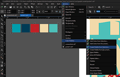
Figure B
The two main colors for this summer company—teal and navy—proved to be a bit dark next to each other, so I used a tint of the teal PMS color to create more contrast. This brings me to another tool option inside the Color Picker: the tint slider. When using a PMS color, a tint slider can be adjusted to a specific percentage of color (figure C). Using this tint slider ensures the hue does not change, only the tint. From the newly created tint, new RGB and CMYK colors can be generated to match. Then I can use the eyedropper tool from the custom palettes I made to add the new colors to the palette.
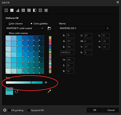
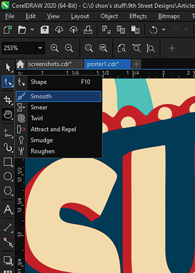
Figure C and D
As I mentioned earlier, I wanted to make this design a bit irregular, less uniform. That means rounding off sharp edges and adding imperfections to some shapes. All the text and the dots that were first created received some treatment from the Smooth and Attract and Repel tools, all located in the Shape tool flyout (figure D). These tools have the ability to push, pull, and smooth bumps and edges of a vector graphic. Figure E shows a before-and-after treatment using these tools. The Nib (brush) size and speed of the effect can be modified to accommodate the amount of the effect needed.

Figure E
One of the final treatments applied to the poster was a wrinkled-paper overlay to help age the paper. This treatment was originally done in Photoshop for this project, but it can be done using Corel Photo-Paint or CorelDRAW. For this tutorial, I’ll demonstrate using CorelDRAW.

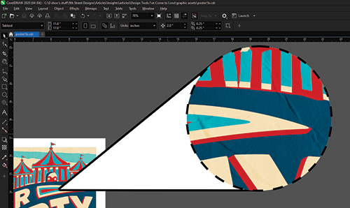
Figure F and G
The first step was to find an image of wrinkled paper at the size and resolution (300 ppi) appropriate for the poster (figure F). My go-to website for free textures is texturelabs.org. This particular image is named Paper 313XL. Before I imported this image into CorelDRAW, I opened it in Photo-Paint to rotate and remove all color. This can be done in a couple of ways. Go to Adjust > Auto Desaturate or go to Image > Mode > Grayscale to remove all color. Now in shades of gray, the image can be imported into the CorelDRAW workspace. Cropped to fit the page and with the texture image selected, set the Transparency tool to Uniform Fill and the Merge Mode to Overlay. See (figure G) for a close-up look at the textured result on the poster.
The larger lesson from this tutorial is there is always more to learn in the realm of graphic design, as long as one is open to learning about new tools and techniques and incorporating them into daily use.
Shon Roti is the owner of 9th Street Designs, a sublimation and graphic design consulting and promotional products business. A graphic designer, Shon has spent more than two decades working as a production artist and instructor in the awards and promotional products industry. In 2014, APA named him Speaker of the Year. Contact him at shon@sublimationconsultant.com.