According to the Color Science Lab at North Carolina State University, “Colors are personal psychological experiences that can be generated from various kinds of stimuli, most commonly lights of a specific spectral composition. They are taken to represent a continuum, transitioning within it in various ways. Similar to all perceptual experiences, they are subjective and depend strongly on illumination, [surroundings] and a number of other perceptual phenomena.”
Color Coordinated
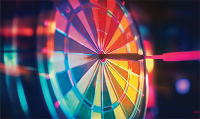
Hitting the mark with color management to make better products.
By: Myrna Traylor
(Originally printed in the January/February 2024 issue of Insights.)
According to the Color Science Lab at North Carolina State University, “Colors are personal psychological experiences that can be generated from various kinds of stimuli, most commonly lights of a specific spectral composition. They are taken to represent a continuum, transitioning within it in various ways. Similar to all perceptual experiences, they are subjective and depend strongly on illumination, [surroundings] and a number of other perceptual phenomena.”
Good to know.
But what are the nuts and bolts that a personalization professional needs to know to ensure a job comes out with the perfect colors? A lot will depend on the printing process being used (for instance, sublimation vs. UV printing) and the item being printed. In addition, knowing a little color theory can help. Colors that are complementary, or opposite one another on the color wheel (a really useful tool; if you don’t have one, get one), can seem to visually “vibrate” when they are next to each other (think bright yellow and purple, for example). Analogous colors are color wheel neighbors (like red, red-orange, orange and yellow) that don’t really compete with one another and offer a more harmonious look.
This knowledge can come in handy when a customer wants to, for instance, print pale pink letters on an orange water bottle. Across the personalization-making spectrum, there are ways to approach these kinds of color problems so that you can always create a pleasing product and give the customer what they want.
Sublimation
Austin Weisenbach, sublimation specialist at JDS Industries, fields calls from personalization professionals about getting the best possible color output. “Most of our calls that we get on a regular basis are troubleshooting calls. They’ll typically already have the end-user’s artwork that has been sent to them, and it’s a matter of trying to tweak that or seeing if there’s a better way to achieve more vibrant colors.”
Weisenbach explains that all sublimation ink is transparent ink, so the surface on which the image is printed can show through and affect the color perception. “When you’re printing on anything on a yellow or gold metal, for example, you might want to remove a little bit of the yellow in the design,” he says. “Just take a little bit of that percentage of color out to account for that yellow that’s already on the metal itself. That’s going to be a straightforward process with our Sawgrass printers; there is actually a gold metal setting within the color management driver.”
The big thing, Weisenbach continues, “is that our eyes are still going to perceive that yellow metal with the blue and the red on it the same way they would if it was on a white metal, so it’s really more about your perception. As an example, when printing on gray or silver metal, that gray or silver is going to take the place of anything that is white within your design. So your eyes are still going to think that it’s white, which is helpful.”
UV printing
Michael Gass is an equipment specialist at PDS Equipment and works with customers who have purchased UV printers from PDS. When he describes the kinds of challenges personalization professionals have with color management, he says that he divides their needs into three classes. First, “would be the ability to have pleasing color. The second would be the ability to predictably repeat what you’re doing, and then the third is what I call ‘paint by numbers,’ which is where you really get into what the numbers are and what everything means, and using a densitometer, a densitometer program and having someone come in and profile your machines,” he says. (A densitometer is an instrument that helps determine optical, photographic or mass density.)
“UV is meant to print directly on wood, glass, metal, aluminum,” Gass continues. “Typically, you have to take into account the base color of the material or put white down first. Our UV printers do a great job of printing white.”
Gass also recommends getting as much color information from a customer as possible when color matching. “If somebody really needs an exact color, have them give you
a sample,” he says. “And if they say ‘well, it’s PMS so and so,’ then make sure your PMS book and their PMS book are the same because there are different versions of PMS books with colors coded on the same number that actually look different just because that’s how that whole world works.”
If a customer provides you with their digital file, you will have more control over the final output, Gass explains. “That color is going to have CMYK, RGB or PMS numbers associated with it. And when you pull it in, you’re automatically going to know what that number is. You print it and compare it to the physical sample. If it looks good, great. If it doesn’t look good, that’s when you have two options.
“First, unless the color requirement is super critical, I can look at it and say that needs a little more cyan, a little less yellow. I can modify the numbers, create a little chart, print it and immediately know where my numbers are,” Gass continues. “The second way to do it is with software. And that’s where you’re going to use a densitometer to scan the sample; it’s going to give you some numbers that will give you a little chart to print out to verify that color does indeed match.”
Charting it out
Greg Azorsky is the owner of Recognition Plus in Independence, Missouri. “We have both UV printing and sublimation here,” he says, and he relies on his background as a graphic designer for color selection, matching and performance. He mentions a reference work that provides a quick understanding of how a color’s perception changes depending on the background. “Josef Albers wrote a book called ‘Interaction of Color,’ and in that book, there are exercises you can do where you’re taking the same color and putting it on top of two different colors. And when you look at that top color on one, it can look different than it looks on the other one.”
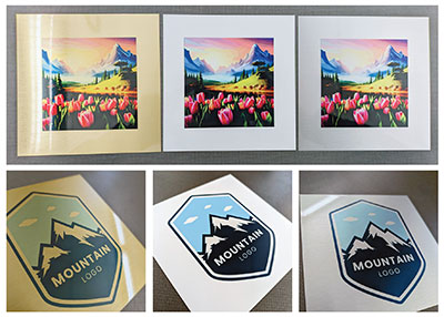
Gold, white and silver metal comparisons from JDS
Another resource that professionals can use is color charts provided by printer suppliers and equipment dealers. “JDS has color charts on their website that you can download and print them or sublimate them as samples on different color substrates,” says Azorsky. “If you want to do it on white metal, gold metal and silver metal, [the chart] gives you the RGB values of each swatch, and you can use that to try to match your colors. I printed that as a reference to have on hand because in sublimation when you print out on paper, the colors don’t look anything like what they’re going to look like when it comes out of the heat press.”
Azorsky has also had to do some troubleshooting with the sublimation process. “In my experience, if I’m sublimating an item and it doesn’t get enough heat, the color is lighter—it’s not as intense. Although we pretty much sublimate everything at the same temperature, around 400 degrees Fahrenheit. But the time varies. I’m not doing really fragile stuff, but I’ll check the instructions before I do it to make sure. We do a lot of sublimated coasters. Those things really aren’t going to melt or anything.”
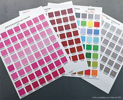
Weisenbach concurs and recommends using the color palettes that JDS provides. “The idea behind those color palettes is that you can print those out on your sublimation printer and then press them onto a piece of scrap or metal to be able to see what that final color is going to be because, within sublimation, you have to use RGB values—CMYK or Pantone or any other color process does not work because of the heat-pressing process. That color is going to shift slightly when it’s pressed in the heat press. Do as many swatches or color palettes as you would like, knowing that a lot of those colors can shift a little bit during that pressing process, and you can never predict the color based on what it looks like on your computer or when it’s printed. You always have to press it on the heat press to figure out what that final color is going to be. And then, from there, we have RGB values listed under each individual color swatch palette. So, once you find out what the actual color is going to be—in the very end process on that piece or substrate—then you can go in and type an RGB value into your desired program to make sure that it’s going to match.”
“With UV printing, it’s a little easier because you have white ink,” says Azorsky. “You can put down a base of white ink and then print on top of that in order to keep your colors truer.”
Maintenance Phase
 Of course, keeping one’s equipment in top shape and using inks well within their shelf life is important to having good color performance. Austin Weisenbach, sublimation specialist, JDS Industries, says that sublimation printers work best when used regularly. “The less you use it, the less happy they are; the more you use these printers, the better off you’re going to be,” he says. “I always recommend performing maintenance once a week if you’re not using it.”
UV printers can take slightly longer “rest breaks,” says Michael Gass, an equipment specialist at PDS Equipment. “You can let a UV printer sit up to four weeks,” he says. “You can probably let it sit longer, but I tell my customers not to let the printer sit any longer than two weeks.”
Greg Azorsky, the owner of Recognition Plus, points out that inks for both types of printing come with expiration dates, but he usually uses up his inks well before that date arrives. Still, it’s important to clean the printheads multiple times a day with heavy use. And if your color output is imperfect, running a test can detect a blocked nozzle. “You could be missing one whole color. Your yellow might not be printing, and that’s going to solve your problem. So, the first step would be a nozzle check, then head cleaning. It may take multiple cleanings,” he says.
The Difference Between CMYK and RGB
Two common color models are used to display and/or print colors. CMYK, which is used for standard printing, uses a combination of four ink colors (cyan, magenta, yellow and black) to generate a wide range of colors, tones and hues.
RGB (red, blue and green) is another system that combines those three colors to elicit a broad range of colors for television, computers and other displays.
 Although there is a fair amount of overlap between the two systems, the RGB range is bigger. Because of this, there is a color management function in design programs that can translate an RGB value into a CMYK equivalent (or vice versa) that can be understood by your printer.
“It’s a pretty quick and easy process,” says Austin Weisenbach, sublimation specialist, JDS Industries. “It is somewhat common that we’ll get a call about converting CMYK to RGB. The entire reason that we use RGB colors is because the CMYK color spectrum is much smaller. You can get a much broader range of colors and a brighter and more vibrant range of colors with RGB color mode.”