To receive a substantial and rewarding project, sometimes the less consequential ones may need to be addressed first. This matches the saying I often use, “broccoli before brownies.”
Broccoli Before Brownies
Turning a simple flier project into a van wrap—a reminder that there are no small projects.
By: Shon Roti
(Originally printed in the September/October 2023 issue of Insights.)
To receive a substantial and rewarding project, sometimes the less consequential ones may need to be addressed first. This matches the saying I often use, “broccoli before brownies.”

Many of my clients’ projects do not require a heavy amount of design effort, but that doesn’t mean I disregard them, delay them or give them less thought than they deserve. Occasionally, even simple and small projects lead to larger and more rewarding ones. Take the flier in Figure A, for example. A flier, although a somewhat simple marketing tool, should not be boring. If you are handed a poorly designed flier, the distributor of the flier might as well accompany the handout with the words, “Hey, could you throw this away for me?”

To avoid that immediate disregard, a flier should create interest using some (or all) of the following design principles. (Figure B illustrates where some of these elements can be identified on the flier.)
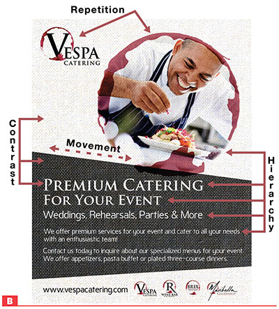
- Contrast: When design elements are close in proximity to one another but are visually dissimilar in some way (light and dark background, white text on dark background).
- Hierarchy: Using key design elements (color, shape, font size, alignment and contrast) to create emphasis.
- Repetition: Using similar design elements (shapes, colors, fonts) to create unity and cohesion (logo in upper left, photo border design and logos in lower right).
- Emphasis: The design focus, which can be attained through several methods. The size of the photo and the contrasting text on the dark background are the two key focal points that deliver the flier’s message.
- Movement: Design elements helping lead the viewer’s eye across the page in a predictable manner. This is done using different design element sizes (photo), lines (asymmetrical background shapes) and hierarchy (font size and placement).
- Alignment: Arranging design elements to create order and pleasing connections to one another (left-justified text, logo aligned with text).
- Balance: Design elements arranged to show stability, either symmetrically or asymmetrically (logos, text, graphics and the photo placed somewhat evenly across the page, left to right and top to bottom).
- Harmony: A combination of color, font size and weight, and repetition of design elements that make the overall design easy to view and understand.
With the flier project, the client suggested some changes. But after a few modifications, the client was excited about using this marketing piece to begin showcasing the new business.
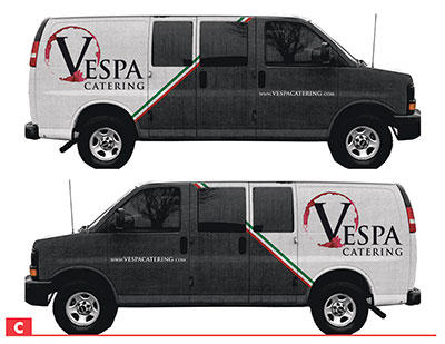
It was only a few weeks later that the same client wanted a vehicle wrap design for a catering van. This would be my first vehicle wrap design, and I was happy to have the opportunity to help with the new, more significant project.
Undeterred by my lack of experience with vehicle wraps, I surmised that a plain white van was not that much different than a blank page. I simply took some measurements of the van’s side profile, hood and rear and made those the dimensions of my “canvas” in CorelDraw. The same design principles that I applied to the catering flier would help shape the design of the van, as well. In fact, I used the same design motif. This would ensure continuity and help the audience connect the flier with the van wrap design. Everything from the linen background, asymmetrical lines, fonts, logos and color schemes from the flier would be employed in the van design to create a sense of unity. My client agreed with the concept, and I created a mock-up (Figure C). As with the flier, the client had a few design modifications, but the project moved rather quickly due to the reuse of the flier design. The client was also quick to approve it since it was such a familiar design.
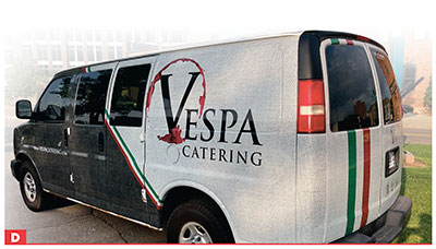
After working with the vehicle wrap production team to make the artwork production-ready, my first vehicle wrap design came to fruition a month after final approval (Figure D). I also had a happy client and another feather in my design cap. And it all started with a thoughtful flier design.
Design matters for every project, whether it’s as small as a lapel pin or as large as a banner. All this work matters to the client, too, so the same design standards and principles should be used for all design projects, big or small. More work and more rewards will follow. After all—broccoli before brownies.
Shon Roti is the owner of 9th Street Designs, a sublimation and graphic design consulting and promotional products business. A graphic designer, Shon has spent more than two decades working as a production artist and instructor in the awards and promotional products industry. In 2014, the Awards and Personalization Association named him Speaker of the Year. Contact him at shon@sublimationconsultant.com.