For several years, I’ve had the good fortune to work with the Badger Clark Foundation as a board member, graphic designer and merch distributor. Through education, fundraising and donations to local poets and artists, this organization promotes humanities and Badger Clark, South Dakota’s first poet laureate. One of my roles has been to create the posters for the annual music event known as “Badger Stock.” This year’s event promises to be particularly special, as it will be featured as part of a PBS documentary showcasing the life and writings of Badger Clark himself. So this year’s poster needed to be special, too.
Creating Watercolor Effects
A CorelDraw tutorial that doesn’t require much real-world watercolor experience.
By Shon Roti
(Originally printed in the May/June 2023 issue of Insights.)
For several years, I’ve had the good fortune to work with the Badger Clark Foundation as a board member, graphic designer and merch distributor. Through education, fundraising and donations to local poets and artists, this organization promotes humanities and Badger Clark, South Dakota’s first poet laureate. One of my roles has been to create the posters for the annual music event known as “Badger Stock.” This year’s event promises to be particularly special, as it will be featured as part of a PBS documentary showcasing the life and writings of Badger Clark himself. So this year’s poster needed to be special, too.
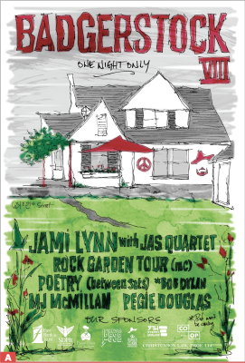
Inspired by the sketching and watercolor tutorials I recently discovered online, I’ve begun to take up pen and paper again and practice the skills that started me on my path to the graphic design career I have now. With a goal to add some dimension to my artwork and with my renewed interest in sketching, I decided to incorporate those hand drawing skills for the event poster (Figure A).
Sketching is one thing. Watercolor is a whole other animal. And though I have started practicing my techniques, my skills were not ready to produce something for public scrutiny. So, like many times before, I used the skills I have learned as a graphic designer to work around my handicaps using techniques in CorelDraw. Following this article, you too can appear as though you’ve been working as an accomplished watercolor artist.
I should note: There is a “watercolor effect” in Corel Photo-Paint that uses AI technology to mimic the tutorial in this article. Having tried both techniques, I believe the steps in this article to be much more convincing and, more importantly, more genuine and satisfying. This effect also involves real water coloring but requires very little experience.
The CorelDraw Steps
After several attempts to sketch the venue and the verbiage for the poster, I scanned the drawing (in black/white, 300 DPI), and imported the file into a 12x18 CorelDraw document. I also scanned my watercolor efforts in grayscale mode at 300 DPI. (There is more info on the watercolor steps later in the article.)
Note: Every major step in this process warranted its own page in the CorelDraw file—the sketch, the added color, the watercolor effect and the various modifications of each of those major elements. The advantage to having a separate page for these steps is to easily modify any particular part of the poster’s graphic elements if needed.
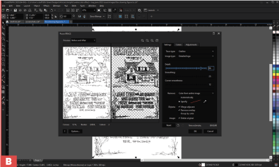
After importing the sketch, I changed the bitmap to vector art by going to Bitmap/Outline Trace/Detailed logo. I recommend removing the white background to save some precious time (Figure B). This would be page one.
Next, I selected all the objects, grouped them (Control+G) and locked the objects by right-clicking and selecting the Lock option. This will prevent these graphics from moving while the next steps are taken.
I then used the pen tool (F5) to loosely create the various shapes needed to fill the areas of the text, house, foliage, etc. I say loosely because sketching and watercolor are not necessarily a precise medium, nor should they be. These graphics will be the substitute for actual colors of the “watercolor” part of the poster.
As vector graphics, the color and shape of the objects can be quickly changed. Once I was satisfied with the added fill objects and colors, I selected all the new colored graphics (the sketch graphic is locked, so there was no need to worry about accidentally selecting it). I then copied them and pasted them (Control+C, Control+V) onto pages two and three. I then deleted the colored graphics from page one.
On the third page, I changed all the colored vector objects to an RGB bitmap. To do this, select all the objects on the page and go to Bitmap/Convert to bitmap and select options for 300 DPI, RGB mode, Anti-aliasing and Transparent background. This image will then open
in Corel Photo-Paint.
The next step was to blur the image to soften the edges. This helped make the poster look less like vector art and more like a watercolor creation. To do this, go to Effects/Blur/Gaussian blur. Move the slider to about 10 pixels. Save the image, and close the document. The changes will be saved in the CorelDraw file.
Going back to the first page in CorelDraw, I right clicked on the sketch graphics and selected “Unlock” to be able to select them. I copied and pasted them onto the blurred image on page three.
Adding the Watercolor Effect
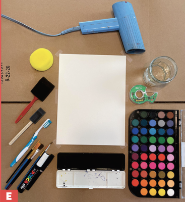
The first step is to do some actual watercolor art. There are just a few tools needed for watercolor painting: a cup of water, watercolor paper, watercolors and a few brushes (Figure E). A hair dryer is a nice option if you plan to make several attempts and want to stack your paper without any smudging.
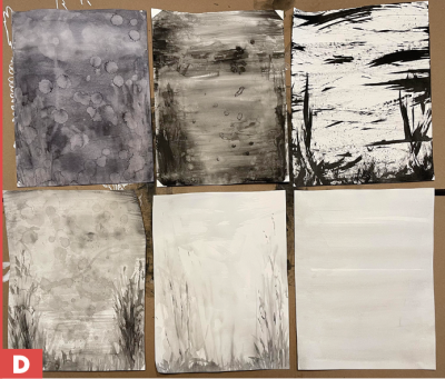
I made about a dozen really awful attempts in less than an hour and chose to keep half (Figure D). As long as the paint is dark enough to make good contrast, the color of the paint is not relevant. I then scanned them all in grayscale mode at 300 DPI. A JPEG or PNG file is fine.
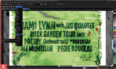
Next, I imported and placed the watercolor file, centering it onto the graphics on page three (the blurred image). With the image selected, I then added a transparency effect with an overlay merge mode (Figure C). The opacity slider on this tool will modify how much influence it will have on the layers and graphics below it. This image is the substitute for the actual brush strokes that could have been applied to the sketch itself. As a grayscale image, the hues of the poster’s colored graphics will not be affected, only the tint and the shade of the colors will change.
By getting out of my comfort zone and adding hand-drawn works and paint, I was able to broaden my range of abilities as a designer, and my clients appreciated it. These are the same clients who will also be purchasing promotional products and merch with these new fresh designs.
Shon Roti is the owner of 9th Street Designs, a sublimation and graphic design consulting and promotional products business. A graphic designer, Shon has spent more than two decades working as a production artist and instructor in the awards and promotional products industry. In 2014, the Awards and Personalization Association named him Speaker of the Year. Contact him at shon@sublimationconsultant.com.