JDS Industries provides a CorelDRAW/Photo-Paint tutorial on how to fix poor-quality artwork for a personalized, laser-engraved product. See how a blurry, faded, handwritten recipe was altered in CorelDRAW and Photo-Paint before being lasered onto a bamboo cutting board to create a sentimental personalized gift.
Tutorial: Fixing Poor-Quality Artwork for Cleaner Laser Engraving
A CorelDraw/Photo-Paint Tutorial
By Shon Roti, JDS Industries
(Originally published in the April 2017 issue of Insights.)
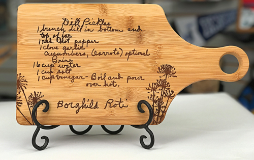
FIGURE A: The final product is a unique and personal product that anyone would be proud to display—or use daily in their kitchen!
Recently, I was discussing artwork for a project with a
JDS customer, Stacie Dannenhauer of LaserCreations.
The project involved lasering a handwritten recipe to a
bamboo cutting board. Sounds fairly straightforward, right?
However, there was an issue, and it’s one that we have all
dealt with: poor-quality artwork (the lemon).
We all know the old proverbial phrase, “If life gives you
lemons, make lemonade.” But, lemonade, of course,
requires sugar, and that is the point of the adage—you need
to take what you have and make it better. Otherwise, what
you have is just an undrinkable liquid.
The technique I shared with Stacie—and now with you—
is one that I used when I was a production artist in our
fabrication department, which I nearly had forgotten about
until we spoke.
Any version of CoreDRAW and Photo-Paint can be used
when following along with this tutorial, except the last
part, which is optional. I will be using CorelDRAW X8 and
Photo-PaintX8. This tutorial’s relevancy is not restricted
to just lasering, but it does work best with an image that
only needs to be rendered to a black and white bitmap or a
single-color vector graphic.
Rather than risk giving away someone else’s favorite recipe,
I’ve used my grandmother Roti’s dill pickle recipe as the
example for this tutorial. FIGURE A illustrates the end
result from this tutorial using an image that originally was scanned at 150dpi (FIGURE B). Notice the blurriness of
the handwriting in Figure B, which will look even worse
when I change it to a black and white bitmap. This is the
image that I will attempt to fix.
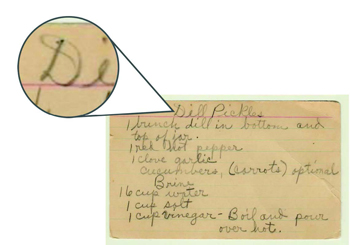
FIGURE B: Even magnified, handwriting on old documents such as this recipe often is barely legible and unsuitable for lasering.
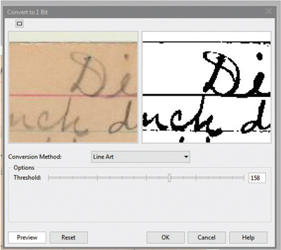
FIGURE C: After converting the image to black and white, a window enabling you to adjust the Threshold will automatically open.
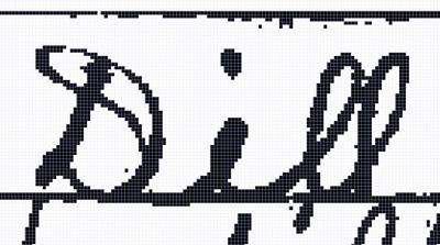
FIGURE D: After adjusting the Threshold slider, the image may appear more pixilated.
In addition to the low resolution, there also is not much
contrast between the light pencil marks and the yellowed
index card, adding another level of difficulty. The focus of
this tutorial will be to add contrast, fix some trouble areas,
and smooth out the pixelated edges of this low-resolution
image without compromising the handwriting style and
readability.
I should mention that before you devote time and energy
into fixing the artwork from your customer, it may be worth
the time to ask if there is an original hard copy or a better quality
digital file that can be used. A quick e-mail or phone
call to the customer could save you a few steps.
THE PHOTO-PAINT STEPS
-
Launch Corel Photo-Paint and open the image
(Ctrl+O). If the image is in RGB, CMYK, or grayscale
mode, change the image mode to black and white
by going to Image>Convert to Black and White (1
bit). A window will open to enable you to adjust
the Threshold (FIGURE C). Zoom in closer to the
artwork by clicking on the left window. Move the
Threshold slider around until you are satisfied
with the adjustment. This step is one of the more
important adjustments, so take your time to get this
part just the way you want it. If you have the slider
too far left, much of the handwriting may disappear.
If the slider is too far to the right, unwanted pixels
will be added that you will have to clean up later.
As mentioned, the image may appear worse after
this step because of the visible pixelization that
has occurred (FIGURE D). But fear not, it will get
better.
- Next, change the mode to grayscale by going to
Image>Convert to Grayscale.
- The next step is to increase the number of pixels
in the image. Go to Image>Resample. Change the
Resolution to 600 dpi for the horizontal; the vertical
should change with it automatically (FIGURE E).
Click OK. This step does not increase the readability,
but pixels will fill in and around hard edges and offer
more data/pixels to work with for the next steps.
FIGURES F and G illustrate the letter “D” in the
artwork up close, before the resampling and after.
- Now remove any unwanted pixels from the artwork.
In this instance, I’ve decided to remove the index
card lines and some other random pixels. You can
use the Rectangle Mask tool (r) to select an area and
click the Delete button, or use the Erase tool (x) to
remove the pixels. Remember to adjust the Nib size
(brush size) as needed.
- Fix any broken or missing areas of the handwriting.
For this fix, I like to use the Eraser tool in the
negative space. Go to Image>Transform>Invert the
colors. Select the Eraser tool (x) and change the
nib size (brush size) in the Property bar. At 600
dpi, a nib size of 10 is about the same thickness
as my grandmother’s pencil point. Use this tool
to connect white areas as needed (FIGURE H).
What you choose to fix in this step is going to be a
judgement call, but don’t get too overzealous with
the Eraser tool. You’ll want to make sure it still looks
like someone else’s handwriting and doesn’t look
overcorrected. You may find that leaving some areas
unfixed helps with authenticity. I’ve chosen to fix
just enough to keep it legible.
- In the next few steps, the techniques I use will help
continue to smooth out the edges of the handwriting.
With the image still inverted in the negative, go to
Adjust>Brightness/Contrast/Intensity (Ctrl+B).
Increase the Contrast to 100% but leave the
Brightness and Intensity at 0.
- Invert the image again and add a slight blur. Go
to Image>Transform>Invert the colors, then go to
Effects>Gaussian Blur and set the Radius to 2 or 3
pixels (FIGURE I). Click OK.
- Open Brightness/Contrast again (Ctrl +B) and
increase the contrast to 100% and slowly decrease
the Brightness to about -10. You should see the
black areas start to thicken. Now repeat this entire
step (Contrast and Brightness). The edges should appear sharper and smoother.
- Invert the image again back to the negative and blur
the image again by 2 or 3 pixels. Open Brightness/
Contrast again (Ctrl + B), increase the contrast to
100% and slowly increase the Brightness to +10.
Now you should see further improvements to the
edges of the artwork. FIGURE J illustrates the
letter “D” in the artwork at this stage of the tutorial.
- Finally, Increase the contrast by 100% and then
change the mode back to a black and white bitmap.
Go to Image>Convert to Black and White (1 bit) and
keep the Threshold slider in the middle (about 130).
Save as a TIFF or PNG file.
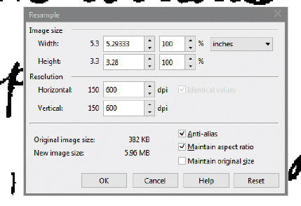
FIGURE E: Change the Resolution to 600 dpi; the horizontal and vertical sliders should change together automatically.

FIGURE F: The artwork before resampling.

FIGURE G: The artwork after resampling.
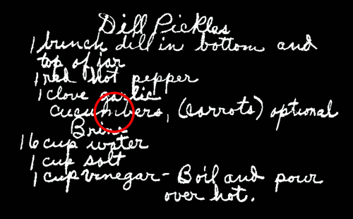
FIGURE H: Use the eraser tool to connect any gaps that may have been created.
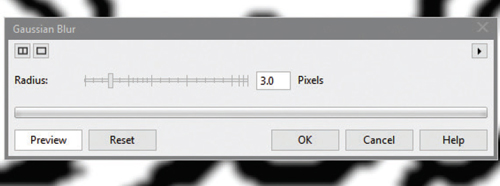
FIGURE I: Add blur as shown above to help smooth out the edges of the handwriting.

FIGURE J: The edges of the artwork appear substantially smoother.
CORELDRAW STEPS
- Launch CorelDRAW and import the new file you
have created (Ctrl + I). With the bitmap selected,
launch Trace Bitmap, Detailed Logo (FIGURE K).
If you are prompted by a window that is asking
you to reduce the bitmap, click on Reduce Bitmap.
A new window will open and the rendering process
will start automatically. Generally speaking, you
will have better luck increasing the Detail to its
maximum, but keep the Smoothing and Cornering
low to maintain the details in the artwork
(FIGURE L). As an option in this window, you
can also choose to Remove Background, leaving
only the original bitmap and the vectorized
handwriting to remain. Click OK.
- Once the artwork is rendered to a vector, ungroup
the new artwork (Ctrl +U) and delete the original bitmap that is underneath.
- Select and delete any residual white areas inside
some of the letters. I’ve placed a gray box behind
the artwork to help reveal these pieces (FIGURE
M).
- If you have CorelDRAW X7 or X8, select the
Smooth tool located in the flyout of the Shape tool
in the Tool bar (FIGURE N).
- Choose the Nib size and Rate from the Property
bar that are small enough to affect only part of an
individual letter. A nib size of .0625 (1/16 inch)
should be about right. Set the Rate (the speed at
which changes occur) to 50 (FIGURE N).
- Click on the artwork with the Smooth tool to select
it and then click again and hold over any area that
requires flattening or smoothing. Notice the bumps
flattening out in real time. FIGURES O and P show the word "Dil" before and after using this too.
Check out the final results of this artwork lasered into a
bamboo cutting board (GFT172; FIGURE Q).
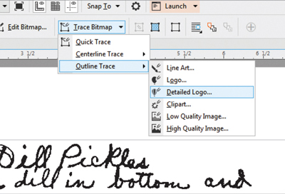
FIGURE K: Select Detailed Logo under Trace Bitmap to begin the rendering process.
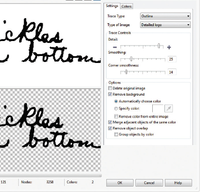
FIGURE L: Adjust the Detail, Smoothing, and Cornering as needed.
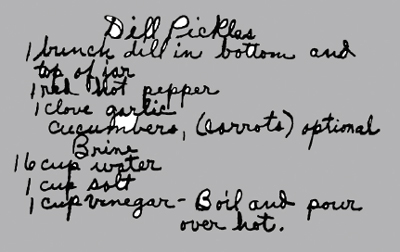
FIGURE M: Be sure to select and delete residual white areas to ensure they are not marked in the final product.
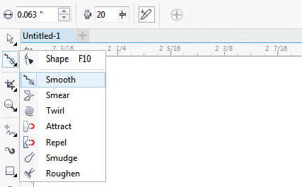
FIGURE N: Set the Rate via the Property bar.
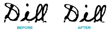
FIGURE O AND P: The word Dill before (left) and after (right) using the Smooth tool.
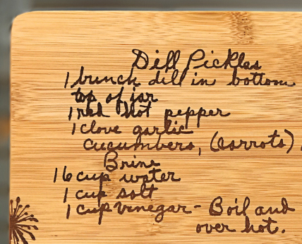
FIGURE Q: The final product makes a perfect gift for parents or grandparents, newlyweds, and amateur chefs and bakers alike!
IN SUMMARY
Over and over, you will find that the public has little idea
about the amount of energy, expertise, and time that
goes into their projects; they only see the end results.
In business, the recipe for success includes exceeding
expectations—and often working with a few lemons.
To view a video of this tutorial and others, go to
our YouTube channel, www.youtube.com/user/
JDSINDUSTRIES.
Shon Roti is a sublimation specialist at JDS
Industries, Inc. He has a bachelor of arts degree
from the University of Sioux Falls with an
emphasis in graphic design. He can be contacted
at shonr@jdsindustries.com. JDS Industries is a
leading supplier in the recognition and
sublimation markets. For more on JDS Industries, visit www.jdsindustries.com.